Rough Guides; responsive re-design
Rough Guides is a leading publisher of travel and reference information known for its ‘tell it like it is’ attitude, accurate, up-to-date content, and informed contemporary writing.
Project type: B2C, Publishing
Role & Responsibilities: Senior Product Designer, responsible for end-to-end user experience and re-design of the Rough Guides website consisting of 30+ templates, all linked to a CMS.Tools: Sketch, Marvel, Miro, UserTesting.com
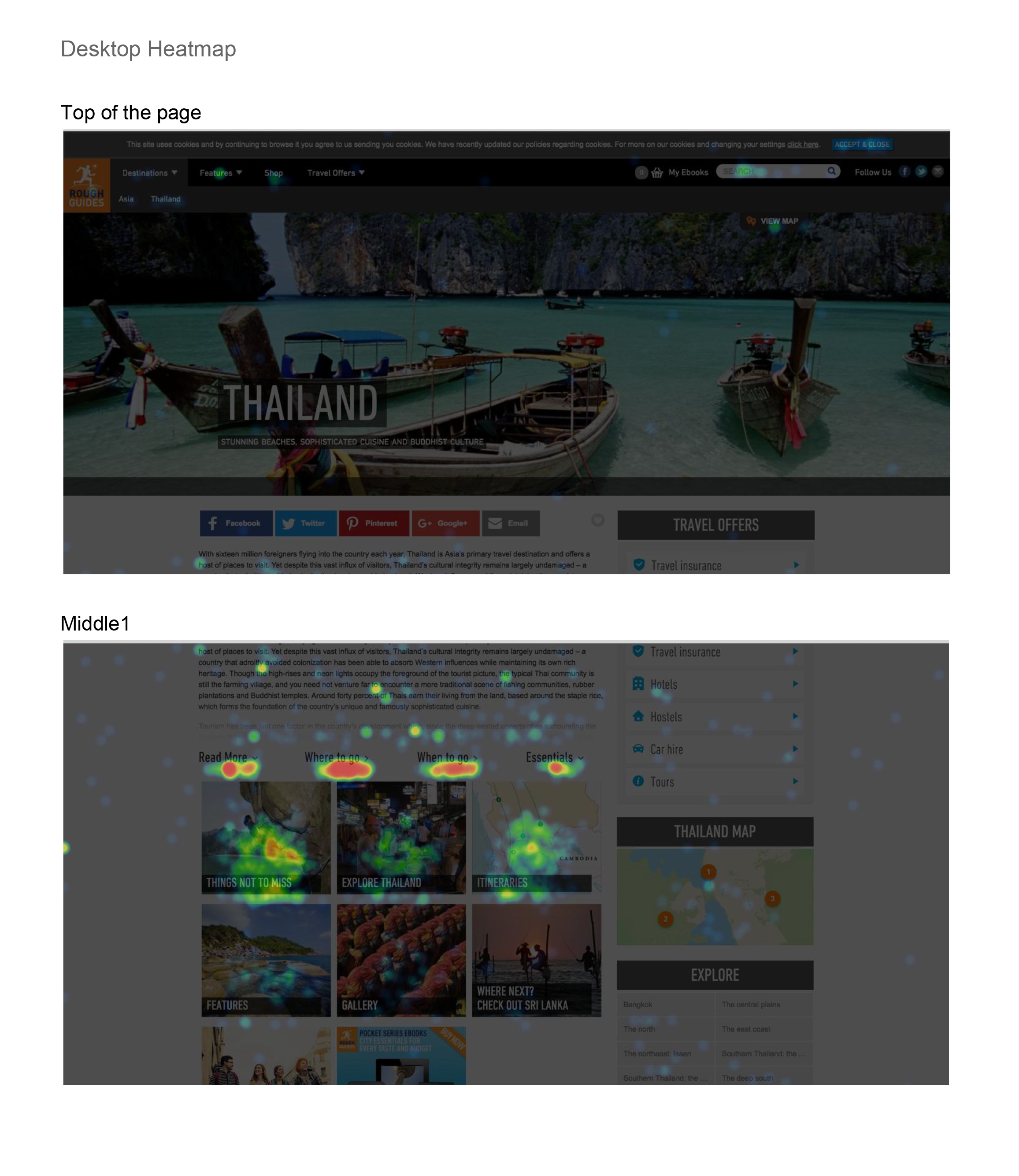
User testing and user behaviour analysis highlighted problems with the existing site.
Key reasons for the redesign
Meet current design standards
Build traffic by improving SEO and code efficiency
Serve our 2016 goals of increasing engagement, brand affinity and revenue
Address serious problem areas highlighted by usability testing and analytics
The website currently has a mobile and a desktop version. This is very bad for SEO as the traffic is split between the two URLs. Merging them will increase traffic and customer reach
Increase dwell time
Improve the mobile and tablet experiences
While retaining the focus on the beautiful photography and engaging content, while enhancing the key business propositions of affiliates, book sell and newsletter signup (data capture
The team, the users
I worked closely with the editorial team, SEO, design teams and project managers. As well as the head of brand for DK head editor - to uphold the Rough Guides identity guidelines.
It's important to note that 'users' in this case, did not only refer to the end users, but also the editorial team, who use the CMS on daily basis, keeping the website updated.
Requirement gathering and research
Firstly I gathered all the exciting information to get a good understanding of the product.
I conducted a range of stakeholder interviews and workshops to gather insights about their goals, and to help prioritise features and define key performance indicators (KPIs).
When it came to rethinking the page structure of each template, I organised a stakeholder workshop where we scored elements for importance to the business and importance to the user. The higher an elements score for both, the higher it would rank on the page. (See image on your left).
Data and statistical analytics
Rough Guides had a wealth of data analytics to emerge myself in. Apart from the demographics and online activity users, other things that was interesting as the mobile vs desktop usage and drop off rate.
Competitive Audit
A comprehensive analysis of competitor products that maps out their existing features in a comparable way. Helps you understand industry standards and identify opportunities to innovate in a given area.
Personas and scenarios
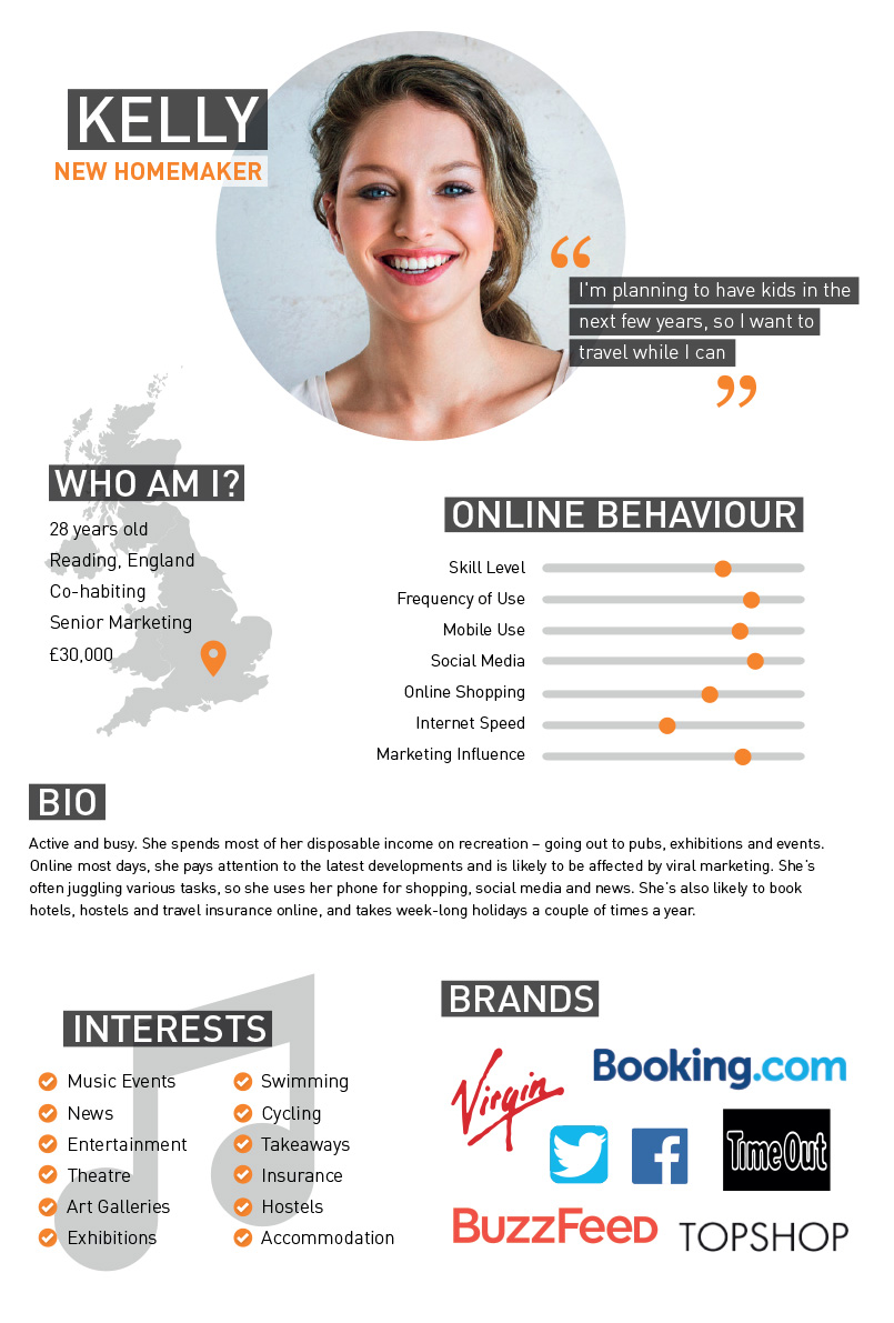
A relatable snapshot of the target audience that highlights demographics, behaviours, needs and motivations through the creation of a fictional character. Personas make it easier to create empathy with consumers throughout the design process.
Creating personas also aid in knowing who to target for user testing.
Diagram depicting the most prominent templates and how they will be altered
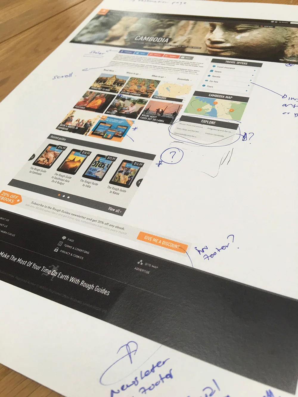
Sketching out ideas
I actually like to sketch through out my entire UX process. It's a quick way to get your message across or even just play with a few ideas before presenting them in a stakeholder workshop.
Wire-framing
Wire-frames for home and article pages
User testing
At DK we used usertesting.com - a great tool for recording what users do and getting direct insight into how they use your product, while leaving valuable comments.
Stakeholder workshops to discuss results of user testing
Collaborative mood-board
Testing UI with prototyping
While working on the Shop templates, I created a few prototypes to test different navigational functionality. This can then also be used in progress presentations as well as user testing.
UI design - UI breakpoints in Zeplin
Footer breakpoints
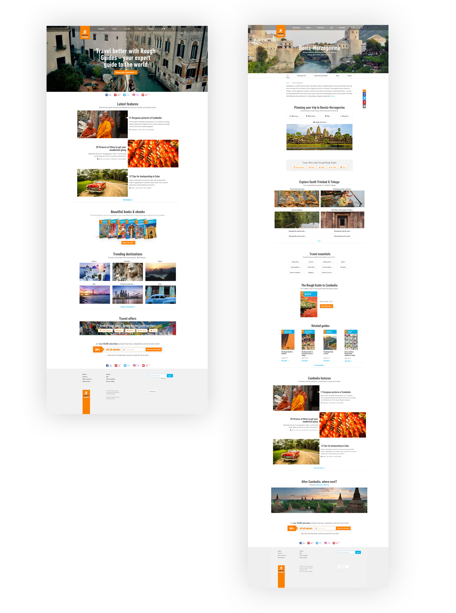
UI for homepage and destinations templates
Responsive set of UI for Rough Guide website, here featuring the Homepage.
The website it set to launch in November. More testing is set to happen once launched, and site will be closely monitored by the SEO and editorial teams.


